1988 Election: Multilevel Modeling
Hierarchical logistic regression for modeling voting behavior. Individuals nested within states, with demographic fixed effects and state-level random intercepts. A classic example from Gelman & Hill.
About the Data
We model individual vote choice in the 1988 US Presidential Election (Bush vs. Dukakis) using simulated survey data (following Gelman & Hill). The data has a natural hierarchical structure:
- Level 1 (Individuals): 6,003 survey respondents with demographic characteristics
- Level 2 (States): 50 states with different political climates (~120 respondents per state)
- Outcome: Binary vote choice (1 = Bush, 0 = Dukakis)
- Bush vote share: 53.5%
Individual-Level Predictors
| Variable | Description | Levels |
|---|---|---|
| Gender | Respondent gender | Male (baseline), Female |
| Race | Racial identification | Non-Black (baseline), Black |
| Age | Age category | 18-29 (baseline), 30-44, 45-64, 65+ |
| Education | Educational attainment | No high school diploma (baseline), High school graduate, Some college, College graduate |
Download the data: election_1988.csv
Why Multilevel Modeling?
Voters within the same state share characteristics we can't directly observe: local economic conditions, media markets, campaign intensity, political culture. Ignoring this clustering causes problems:
| Problem | Consequence | Multilevel Solution |
|---|---|---|
| Non-independence | Standard errors are too small (overconfident conclusions) | Random intercepts account for within-state correlation |
| Unobserved heterogeneity | Omitted variable bias in state-level effects | Random effects absorb state-specific variation |
| Small state samples | Unreliable estimates for states with few respondents | Shrinkage "borrows strength" from other states |
The Key Insight: Partial Pooling
Multilevel models provide a middle ground between two extremes:
- Complete pooling: Ignore states entirely (all states identical) - loses real variation
- No pooling: Fit separate models per state - unstable with small samples
- Partial pooling (multilevel): State estimates are "shrunk" toward the overall mean, with more shrinkage for states with less data
The Statistical Model
We fit a hierarchical logistic regression with random intercepts:
Level 1: Individual Voting
Level 2: State Random Effects
Each state $j$ gets its own intercept $u_j$ that shifts the baseline probability of voting for Bush up or down. These effects are assumed to come from a common normal distribution.
What the Random Intercept Captures
- State political culture (historically Republican vs. Democratic)
- Local economic conditions in 1988
- Campaign intensity and media coverage
- Any other unmeasured state-level factors
pyINLA Implementation
Step 1: Load and Prepare the Data
First we load the simulated survey data and inspect its structure. Each row is one respondent with their vote choice, demographics, and state ID.
import pandas as pd
import numpy as np

# Load data
df = pd.read_csv('election_1988.csv')
print(f"Dataset shape: {df.shape}")
print(f"Bush vote share: {df['bush'].mean():.1%}")
print(f"Respondents per state:")
print(df.groupby('state').size().describe())
Dataset shape: (6003, 7)
Bush vote share: 53.5%
Respondents per state:
count 50.00000
mean 120.06000
std 9.07207
min 102.00000
25% 114.25000
50% 119.00000
75% 124.00000
max 150.00000Step 2: Define and Fit the Model
pyINLA automatically creates dummy variables for categorical (non-numeric) columns, dropping the first level as the baseline when an intercept is present. We convert age_cat and edu_cat to strings so pyINLA treats them as categorical.
from pyinla import pyinla

# Mark categorical columns (integers would be treated as numeric)
df['age_cat'] = df['age_cat'].astype(str)
df['edu_cat'] = df['edu_cat'].astype(str)

# Ntrials for binary outcome
Ntrials = df['Ntrials'].to_numpy()

# Define multilevel model
model = {
    'response': 'bush',
    'fixed': ['1', 'female', 'black', 'age_cat', 'edu_cat'],
    'random': [
        {'id': 'state', 'model': 'iid'}  # Random intercept for state
    ]
}

# Control options: compute model comparison criteria
control = {
    'compute': {
        'dic': True,
        'waic': True,
        'mlik': True
    }
}

# Fit model
py_result = pyinla(
    model=model,
    family='binomial',
    data=df,
    Ntrials=Ntrials,
    control=control
)

print("=== pyINLA Fixed Effects ===")
print(py_result.summary_fixed.drop(columns='kld').to_string())

print("\n=== pyINLA Hyperparameters (State Precision) ===")
print(py_result.summary_hyperpar.to_string())

print("\n=== pyINLA DIC ===")
print(py_result.dic['dic'])

print("\n=== pyINLA Marginal Likelihood ===")
print(py_result.mlik.to_string())
=== pyINLA Fixed Effects ===
mean sd 0.025quant 0.5quant 0.975quant mode
(Intercept) 0.374417 0.100632 0.177003 0.374393 0.571967 0.374394
female -0.177099 0.053916 -0.282825 -0.177098 -0.071379 -0.177098
black -1.372144 0.103406 -1.574927 -1.372140 -1.169388 -1.372140
age_cat2 -0.268209 0.073312 -0.411967 -0.268209 -0.124450 -0.268209
age_cat3 -0.113667 0.073879 -0.258531 -0.113669 0.031208 -0.113669
age_cat4 -0.234295 0.088410 -0.407659 -0.234296 -0.060930 -0.234296
edu_cat2 0.035432 0.072074 -0.105900 0.035432 0.176762 0.035432
edu_cat3 0.405881 0.080641 0.247759 0.405879 0.564018 0.405879
edu_cat4 0.142852 0.092140 -0.037827 0.142852 0.323526 0.142852
=== pyINLA Hyperparameters (State Precision) ===
mean sd 0.025quant 0.5quant 0.975quant mode
Precision for state 5.9919 1.490322 3.557808 5.828241 9.364695 5.516869
=== pyINLA DIC ===
7856.855545675052
=== pyINLA Marginal Likelihood ===
log marginal-likelihood (integration) -4002.291130
log marginal-likelihood (Gaussian) -4002.684146Key points:
'random': [{'id': 'state', 'model': 'iid'}]specifies an IID (independent and identically distributed) Gaussian random effect for each statefamily='binomial'withNtrials=1gives binary logistic regressiondic,waic, andmlikprovide model comparison criteria
Step 3: Visualize the Results
We plot the estimated fixed-effect coefficients with 95% credible intervals. Green dots mark significant effects (interval excludes zero).
import matplotlib.pyplot as plt
from matplotlib.lines import Line2D

# Get coefficients (exclude intercept for cleaner plot)
coef_data = py_result.summary_fixed.drop('(Intercept)').copy()

# Readable labels for each covariate
labels = {
    'female': 'Female', 'black': 'Black',
    'age_cat2': 'Age 30-44', 'age_cat3': 'Age 45-64', 'age_cat4': 'Age 65+',
    'edu_cat2': 'HS Graduate', 'edu_cat3': 'Some College', 'edu_cat4': 'College Grad'
}
coef_data.index = [labels.get(x, x) for x in coef_data.index]
coef_data = coef_data.sort_values('mean', ascending=True)

# Green if significant (CI excludes zero), grey otherwise
y_pos = np.arange(len(coef_data))
colors = ['#059669' if not ((row['0.025quant'] < 0) and (row['0.975quant'] > 0))
          else '#94a3b8' for _, row in coef_data.iterrows()]

fig, ax = plt.subplots(figsize=(10, 6))
ax.hlines(y_pos, coef_data['0.025quant'], coef_data['0.975quant'],
          colors=colors, linewidth=2, alpha=0.7)
ax.scatter(coef_data['mean'], y_pos, c=colors, s=80, zorder=5)
ax.axvline(x=0, color='#e11d48', linestyle='--', linewidth=1.5, alpha=0.7)

ax.set_yticks(y_pos)
ax.set_yticklabels(coef_data.index)
ax.set_xlabel('Coefficient (log-odds scale)')
ax.set_title('1988 Election: Demographic Effects on Bush Vote')
ax.legend(handles=[
    Line2D([0], [0], marker='o', color='w', markerfacecolor='#059669', markersize=10, label='Significant'),
    Line2D([0], [0], marker='o', color='w', markerfacecolor='#94a3b8', markersize=10, label='Not significant')
], loc='lower right')
ax.grid(axis='x', alpha=0.3)
plt.tight_layout()
plt.savefig('election_coefficients.png', dpi=150, bbox_inches='tight')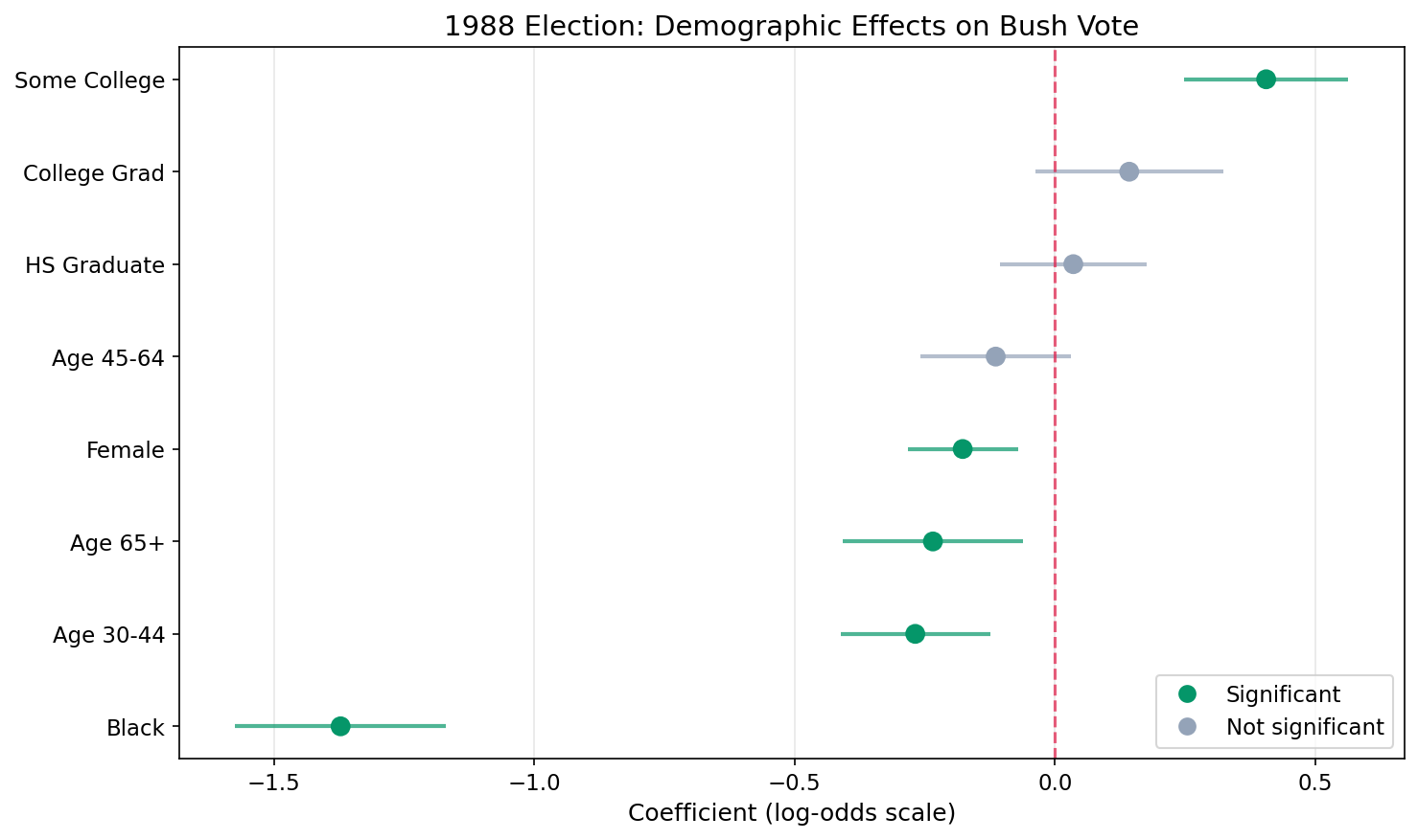
Key Findings
| Effect | Coefficient | Odds Ratio | 95% CI | Interpretation |
|---|---|---|---|---|
| Black | -1.372 | 0.25 | (0.21 – 0.31) | Black voters had 75% lower odds of voting Bush (strongest effect) |
| Some College | 0.406 | 1.50 | (1.28 – 1.76) | Some college increases Bush odds by 50% |
| Age 30–44 | -0.268 | 0.76 | (0.66 – 0.88) | 30–44 age group had 24% lower odds than 18–29 of voting Bush |
| Female | -0.177 | 0.84 | (0.75 – 0.93) | Women had 16% lower odds of supporting Bush |
| Age 65+ | -0.234 | 0.79 | (0.67 – 0.94) | 65+ age group had 21% lower odds than 18–29 |
| College Grad | 0.143 | 1.15 | (0.96 – 1.38) | College graduates slightly more likely (not significant) |
| High School Grad | 0.035 | 1.04 | (0.90 – 1.19) | Minimal difference from baseline (not significant) |
| Age 45–64 | -0.114 | 0.89 | (0.77 – 1.03) | Slightly lower odds than 18–29 (not significant) |
Step 4: Compute Odds Ratios
Exponentiate each coefficient to convert from log-odds to odds ratios. An asterisk marks effects whose 95% credible interval excludes 1 (statistically significant).
# Convert log-odds coefficients to odds ratios
fixed = py_result.summary_fixed
for var in ['female', 'black', 'age_cat2', 'age_cat3', 'age_cat4',
            'edu_cat2', 'edu_cat3', 'edu_cat4']:
    coef = fixed.loc[var, 'mean']
    ci_low = fixed.loc[var, '0.025quant']
    ci_high = fixed.loc[var, '0.975quant']

    or_val = np.exp(coef)        # Odds ratio = exp(coefficient)
    or_low = np.exp(ci_low)      # Lower bound of 95% CI
    or_high = np.exp(ci_high)    # Upper bound of 95% CI

    # Significant if CI excludes zero on the log-odds scale
    sig = "*" if not ((ci_low < 0) and (ci_high > 0)) else ""
    label = labels.get(var, var)
    print(f"  {label:15s}: OR = {or_val:.2f} ({or_low:.2f} - {or_high:.2f}) {sig}")
DEMOGRAPHIC EFFECTS (Odds Ratios for Bush vote):
Female : OR = 0.84 (0.75 - 0.93) *
Black : OR = 0.25 (0.21 - 0.31) *
Age 30-44 : OR = 0.76 (0.66 - 0.88) *
Age 45-64 : OR = 0.89 (0.77 - 1.03)
Age 65+ : OR = 0.79 (0.67 - 0.94) *
HS Graduate : OR = 1.04 (0.90 - 1.19)
Some College : OR = 1.50 (1.28 - 1.76) *
College Grad : OR = 1.15 (0.96 - 1.38)
* = statistically significant (95% CI excludes 1)Understanding Odds Ratios
The model estimates coefficients on the log-odds scale. Odds ratios (OR) convert these into an intuitive multiplicative effect by exponentiating: OR = exp(coefficient).
What Are Odds?
Odds is just another way to express probability.
Probability says: out of everyone, what fraction chose Bush?
60 out of 100 voted Bush → probability = 0.60 (60%)
Odds says: how many voted Bush for every one who didn't?
60 voted Bush, 40 didn't → odds = 60 / 40 = 1.5
Meaning: for every 1 person who didn't vote Bush, 1.5 did.
The formula: odds = p / (1 − p)
How to Read Odds Ratios
| Odds Ratio | Meaning | Example from Results |
|---|---|---|
| OR = 1.0 | No effect, same odds as the baseline group | |
| OR > 1.0 | Higher odds: (OR − 1) × 100 = % increase | Some College OR = 1.50 → 50% higher odds of voting Bush |
| OR < 1.0 | Lower odds: (1 − OR) × 100 = % decrease | Black OR = 0.25 → 75% lower odds of voting Bush |
Key Points
- Each odds ratio compares a group to its baseline category (Male, Non-Black, Age 18–29, No high school diploma)
- The 95% credible interval tells you about uncertainty. If it includes 1.0, the effect is not statistically significant
- Odds ratios are multiplicative, not additive: OR = 0.25 means the odds are multiplied by 0.25 (divided by 4), not reduced by 0.25
- Higher or lower odds of what? Always of whatever the response variable codes as 1. Here the response is
bush(voted Bush = 1), so OR > 1 means more likely to vote Bush, and OR < 1 means less likely to vote Bush. If the response weredemocratinstead, the direction would flip.
Step 5: Plot Odds Ratios
Exponentiate the coefficients and their credible intervals to plot on the odds ratio scale. The red dashed line at OR = 1 represents no effect.
# Exponentiate coefficients to get odds ratios
or_data = pd.DataFrame({
    'OR': np.exp(coef_data['mean']),
    'OR_low': np.exp(coef_data['0.025quant']),
    'OR_high': np.exp(coef_data['0.975quant'])
}, index=coef_data.index)
or_data = or_data.sort_values('OR', ascending=True)

# Green if CI excludes 1 (significant on OR scale)
y_pos = np.arange(len(or_data))
colors = ['#059669' if not ((row['OR_low'] < 1) and (row['OR_high'] > 1))
          else '#94a3b8' for _, row in or_data.iterrows()]

fig, ax = plt.subplots(figsize=(10, 6))
ax.hlines(y_pos, or_data['OR_low'], or_data['OR_high'],
          colors=colors, linewidth=2, alpha=0.7)
ax.scatter(or_data['OR'], y_pos, c=colors, s=80, zorder=5)
ax.axvline(x=1, color='#e11d48', linestyle='--', linewidth=1.5, alpha=0.7)

ax.set_yticks(y_pos)
ax.set_yticklabels(or_data.index)
ax.set_xlabel('Odds Ratio (vs reference category)')
ax.set_title('1988 Election: Odds Ratios for Bush Vote')
ax.grid(axis='x', alpha=0.3)
plt.tight_layout()
plt.savefig('election_odds_ratios.png', dpi=150, bbox_inches='tight')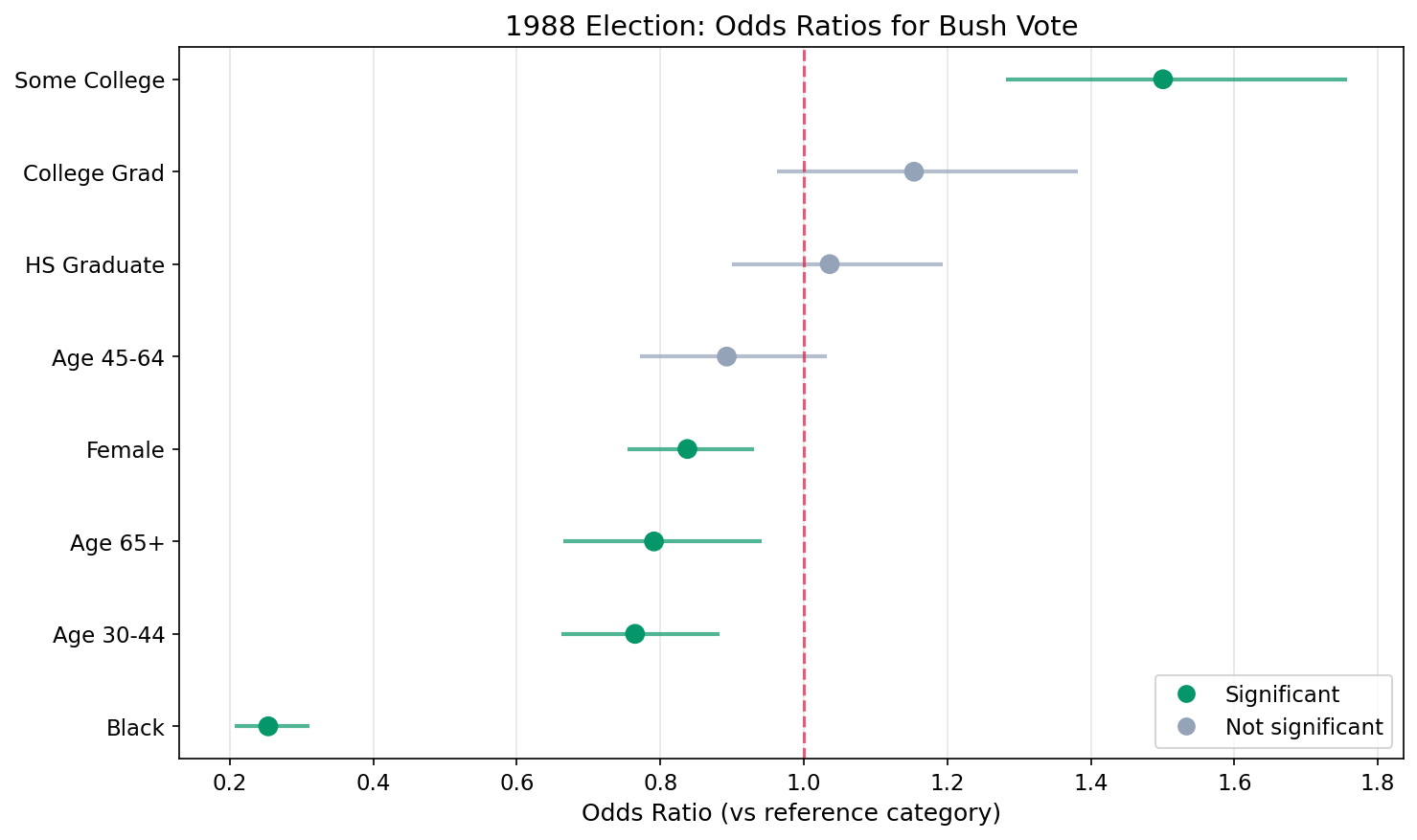
Step 6: State Random Effects (Caterpillar Plot)
The caterpillar plot shows the estimated random intercept for each state, ordered from lowest to highest:
- States above zero: More pro-Bush than demographics alone predict
- States below zero: More pro-Dukakis than demographics alone predict
- Interval width: Wider intervals indicate more uncertainty (often smaller sample sizes)
- Shrinkage: Notice most estimates are close to zero, partial pooling in action
# Extract and sort state random effects
state_effects = py_result.summary_random['state'].copy()
state_effects = state_effects.sort_values('mean')

n_states = len(state_effects)
y_pos = np.arange(n_states)

# Blue if CI excludes zero (state is distinguishable from average)
colors = ['#3b82f6' if not ((row['0.025quant'] < 0) and (row['0.975quant'] > 0))
          else '#94a3b8' for _, row in state_effects.iterrows()]

fig, ax = plt.subplots(figsize=(12, 8))
ax.hlines(y_pos, state_effects['0.025quant'], state_effects['0.975quant'],
          colors=colors, linewidth=1.5, alpha=0.6)
ax.scatter(state_effects['mean'], y_pos, c=colors, s=30, zorder=5)
ax.axvline(x=0, color='#e11d48', linestyle='--', linewidth=1.5, alpha=0.7)

ax.set_ylabel('State (ordered by effect)')
ax.set_xlabel('State Random Effect (log-odds)')
ax.set_title('State-Level Variation in Bush Support (Caterpillar Plot)')
ax.set_yticks([])
plt.tight_layout()
plt.savefig('election_state_effects.png', dpi=150, bbox_inches='tight')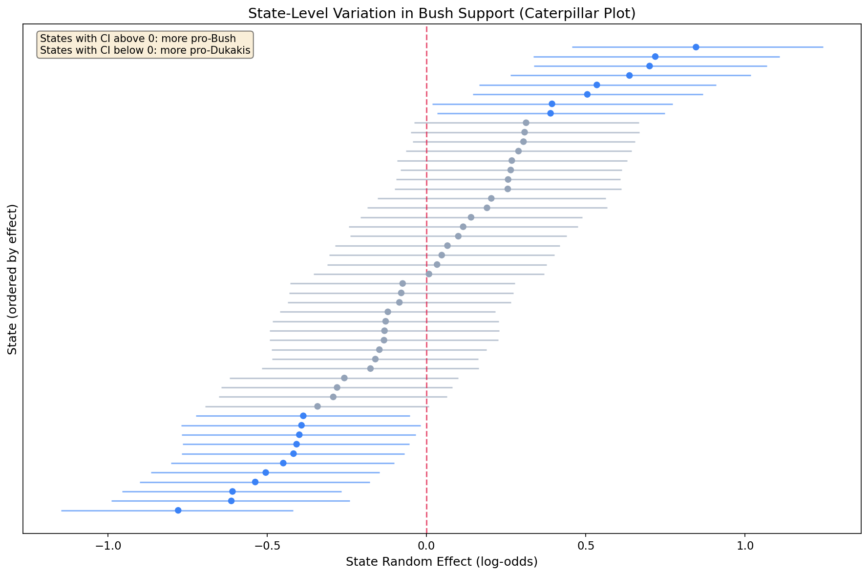
Step 7: State-Level Variance
How much do states vary after accounting for demographics? Convert precision (what INLA estimates) to variance and SD, then plot the distribution of state effects.
from scipy import stats

# Convert precision to variance and SD
prec_mean = py_result.summary_hyperpar['mean'].values[0]
state_var = 1 / prec_mean         # variance = 1 / precision
state_sd = np.sqrt(state_var)     # SD = sqrt(variance)

print(f"State effect precision: {prec_mean:.3f}")
print(f"State effect variance:  {state_var:.3f}")
print(f"State effect SD:        {state_sd:.3f}")

# Histogram of state effects with fitted normal overlay
state_means = py_result.summary_random['state']['mean'].values

fig, ax = plt.subplots(figsize=(8, 5))
ax.hist(state_means, bins=15, density=True, alpha=0.7,
        color='#3b82f6', edgecolor='white')
ax.axvline(0, color='#e11d48', linestyle='--', linewidth=2,
           label='Zero (no state effect)')

# Overlay the fitted N(0, state_sd) distribution
x = np.linspace(state_means.min() - 0.2, state_means.max() + 0.2, 100)
ax.plot(x, stats.norm.pdf(x, 0, state_sd), 'k-', linewidth=2,
        label=f'Fitted N(0, {state_sd:.2f})')

ax.set_xlabel('State Random Effect')
ax.set_ylabel('Density')
ax.set_title('Histogram of posterior mean state effects.\n'
             'The fitted normal distribution shows the estimated between-state variation.',
             fontsize=10, ha='center')
ax.legend()
plt.tight_layout()
plt.savefig('election_state_variance.png', dpi=150, bbox_inches='tight')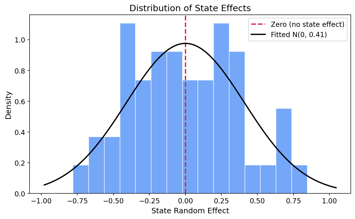
State effect precision: 5.992
State effect variance:  0.167
State effect SD:        0.409

True variance used in simulation: 0.2
True SD used in simulation:       0.447
The estimated state precision is 5.99, corresponding to a variance of 0.167 and a standard deviation of 0.409 on the log-odds scale. The true simulation variance was 0.2 (SD = 0.447), so the model recovers this well. In practical terms, a one-SD shift in the state effect translates to roughly a 50% relative change in odds between typical pro-Bush and pro-Dukakis states.
Understanding Random Effects
Random effects can be confusing at first. Here's how to think about them:
Fixed vs. Random Effects
| Aspect | Fixed Effects | Random Effects |
|---|---|---|
| What they model | Specific categories of interest (e.g., Male vs. Female) | Groups from a larger population (e.g., states as sample from all possible states) |
| Goal | Estimate each category's specific effect | Estimate the variance across groups + improve individual estimates via shrinkage |
| Interpretation | "Females have X% lower odds of voting Bush" | "States vary by SD = Y in their baseline Bush support" |
Why IID for States?
We use model='iid' because we assume states are exchangeable - knowing one state's effect doesn't tell us about another's (no spatial correlation). For spatial applications, you might use model='besag' or model='bym' instead.
Key Takeaways
- Multilevel models handle clustered data: voters within states are not independent
- Random intercepts capture group-level variation: some states are more pro-Bush than demographics predict
- Shrinkage improves estimates: states with little data borrow strength from the overall pattern
- Race was the strongest predictor: Black voters had 75% lower odds of voting Bush (OR = 0.25)
- Gender and age matter: women and 30–44-year-olds had significantly lower odds of supporting Bush
- pyINLA syntax is simple: add
'random': [{'id': 'state', 'model': 'iid'}]
References
- Gelman, A., and Hill, J. (2006). Data Analysis Using Regression and Multilevel/Hierarchical Models. Cambridge University Press. (Chapters 11-14)
- Rue, H., Martino, S. and Chopin, N. (2009). "Approximate Bayesian inference for latent Gaussian models using integrated nested Laplace approximations." Journal of the Royal Statistical Society: Series B, 71(2), 319-392.
- ANES (American National Election Studies) for historical election survey data.