Maps for Areal Data
Download administrative boundaries, build adjacency graphs, and visualize posterior estimates on choropleth maps for Besag and BYM2 models.
Overview
When working with areal data (data aggregated to administrative regions like counties, provinces, or districts),
you need spatial models that account for neighborhood structure rather than continuous distance.
The besag and bym2 models in pyINLA are designed for this.
In areal models, each region needs a unique integer ID (1, 2, 3...). This ID:
- Links your data to the adjacency graph
- Determines which regions are neighbors
- Maps to posterior estimates after fitting
This guide covers the complete workflow:
- 1Download boundaries: Get administrative regions from GADM
- 2Build adjacency graph: Create the
.graphfile for INLA - 3Create ID mapping: Connect region names to spatial IDs
- 4Prepare your data: Add the spatial ID column
- 5Fit the model: Use Besag or BYM2 with the graph file
- 6Plot results: Visualize posteriors on choropleth maps
1. Getting Administrative Boundaries
GADM (Global Administrative Areas Database) hosts free polygon boundaries for every country at multiple administrative levels (country, state, district, ...). Each level is one GeoJSON file you can fetch over HTTP and load directly into a geopandas.GeoDataFrame: one row per region, each carrying a geometry column plus standardised identifier columns.
GeoDataFrame where row i is region i+1. That row index is the same integer ID we'll write into the graph file (Section 2) and into the data column (Section 4). Keep the row order untouched after loading.
Step 1.1 Pick the URL
Every GADM file follows one URL pattern with two placeholders:
https://geodata.ucdavis.edu/gadm/gadm4.1/json/gadm41_{COUNTRY}_{LEVEL}.json
{COUNTRY}: a three-letter ISO 3166-1 alpha-3 code, e.g.,SAU,LBN,USA.{LEVEL}: an integer;0= country outline,1= states/provinces,2= counties/districts,3+= municipalities and finer.
So Saudi Arabia at level 1 is https://geodata.ucdavis.edu/gadm/gadm4.1/json/gadm41_SAU_1.json.
Step 1.2 Download in one line
geopandas.read_file(url) streams the JSON, parses each feature's geometry, and returns a GeoDataFrame. No GIS install needed beyond geopandas itself.
import geopandas as gpd

url   = "https://geodata.ucdavis.edu/gadm/gadm4.1/json/gadm41_SAU_1.json"
saudi = gpd.read_file(url)

print(type(saudi).__name__)
print("rows:", len(saudi))
GeoDataFrame
rows: 13
13 rows because Saudi Arabia has 13 first-level regions. Each row is one region with one (Multi)Polygon geometry.
Step 1.3 Inspect what you got
A GADM file is more than just shapes: each region carries identifier columns plus a geographic coordinate system. Worth checking once before you build anything on top of it.
# Coordinate reference system: GADM always ships lat/lon (EPSG:4326).
print(saudi.crs)

# Identifier + metadata columns alongside `geometry`.
print(saudi.columns.tolist())
EPSG:4326
['GID_1', 'GID_0', 'COUNTRY', 'NAME_1', 'VARNAME_1', 'NL_NAME_1',
 'TYPE_1', 'ENGTYPE_1', 'CC_1', 'HASC_1', 'ISO_1', 'geometry']
Each of those *_1 columns is a different way to refer to the same region; pick whichever matches your dataset's region labels.
Step 1.4 Peek at the first regions
This is the row order GADM happens to ship: alphabetical by NAME_1. Whatever order you see here is the spatial-ID order for the rest of the workflow: the region in row 0 will become ID 1, row 1 becomes ID 2, etc.
print(saudi[['GID_1', 'NAME_1', 'ENGTYPE_1']].head())
     GID_1                NAME_1 ENGTYPE_1
0  SAU.1_1                 'Asir  Province
1  SAU.2_1               AlBahah  Province
2  SAU.3_1  AlHududashShamaliyah  Province
3  SAU.4_1               AlJawf   Province
4  SAU.5_1            AlMadinah   Province
saudi after this point will silently invalidate the graph file you build in Section 2 (the neighbor IDs there point at the original row positions). If you must sort for display, sort a copy and use the original GeoDataFrame for the graph + ID mapping.
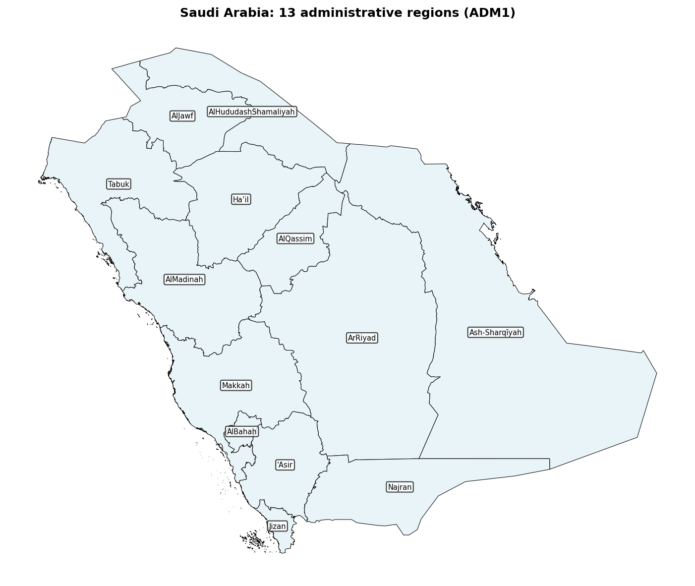
Preview: Saudi Arabia Regions
Drop the GeoDataFrame straight into matplotlib (geopandas wraps the polygons for you) and annotate each region's centroid with its NAME_1:
import matplotlib.pyplot as plt

fig, ax = plt.subplots(figsize=(10, 8))
saudi.plot(ax=ax, edgecolor='black', linewidth=0.5, facecolor='#e8f4f8')

for _, row in saudi.iterrows():
    c = row.geometry.centroid
    ax.annotate(row['NAME_1'], (c.x, c.y),
                ha='center', va='center', fontsize=7,
                bbox=dict(boxstyle='round,pad=0.2', facecolor='white', alpha=0.75))

ax.set_title('Saudi Arabia: 13 administrative regions (ADM1)', fontweight='bold')
ax.axis('off')
plt.tight_layout(); plt.show()
GADM Column Reference
The identifier columns in the GADM ADM1 file (example values are the first Saudi Arabia row):
| Column | Example value | What it is |
|---|---|---|
GID_1 | SAU.1_1 | GADM unique identifier for this region; stable across GADM versions. |
NAME_1 | 'Asir | Region name (English transliteration, sometimes without internal spaces). |
VARNAME_1 | Asir|Aseer|Assyear | Alternate spellings, pipe-separated. |
HASC_1 | SA.AS | Hierarchical Administrative Subdivision Code. |
ISO_1 | SA-14 | ISO 3166-2 subdivision code, when one exists. |
TYPE_1 | Minṭaqah | Administrative type in the local language (Arabic transliteration with diacritics). |
ENGTYPE_1 | Province | Administrative type, English (here: "Province", not "Region"). |
geometry | MULTIPOLYGON(...) | Shapely (Multi)Polygon for the region boundary. |
Reusable helper
If you'll download many countries / levels, wrap the URL pattern in a one-liner:
def get_admin_boundaries(country_code, admin_level=1):
    """ISO 3166-1 alpha-3 country code (e.g. 'SAU'); admin_level in 0..3."""
    url = f"https://geodata.ucdavis.edu/gadm/gadm4.1/json/gadm41_{country_code}_{admin_level}.json"
    return gpd.read_file(url)

saudi  = get_admin_boundaries('SAU', 1)
lebanon = get_admin_boundaries('LBN', 2)  # district-level
Common Country Codes (ISO 3166-1 alpha-3)
| Country | Code | Country | Code | Country | Code |
|---|---|---|---|---|---|
| Saudi Arabia | SAU | United States | USA | United Kingdom | GBR |
| Lebanon | LBN | Germany | DEU | France | FRA |
| Egypt | EGY | Italy | ITA | Spain | ESP |
| Jordan | JOR | Brazil | BRA | Australia | AUS |
| UAE | ARE | Canada | CAN | Japan | JPN |
2. Building the INLA Graph File
The graph file defines which regions are neighbors. INLA uses this to build the spatial precision matrix for Besag and BYM2 models. Two regions are typically considered neighbors if they share a boundary (Queen contiguity).
Graph File Format
The INLA graph file is plain text with one strict rule per line. The file itself contains no header, no comment lines: every non-empty line must parse as integers, and the very first integer is the region count. Below, the leading // annotations are explanations about the file, not part of it:
13                          // line 1: total number of regions (n)
1 2 4 5                     // region 1 has 2 neighbors: regions 4 and 5
2 3 5 6 12                  // region 2 has 3 neighbors: regions 5, 6, and 12
3 2 6 7
4 3 1 5 10
5 5 1 2 4 6 10
6 5 2 3 5 7 10
7 4 3 6 8 10
8 3 7 9 10
9 2 8 10
10 6 4 5 6 7 8 9
11 2 12 13
12 3 2 11 13
13 2 11 12
- Line 1: a single integer, the total number of regions \(n\).
- Lines 2 through \(n+1\):
region_id num_neighbors neighbor_id1 neighbor_id2 ... - Region IDs are 1-indexed (the first region is 1, not 0).
- The graph must be symmetric: if region \(i\) lists \(j\), region \(j\) must list \(i\).
# or // in the file will abort the engine with invalid literal for int() with base 10. Keep your explanatory notes in the surrounding documentation, not in the .graph file.
Build Adjacency Function
from libpysal.weights import Queen

def build_adjacency(gdf):
    """Build adjacency graph and return INLA-compatible graph string.

    Parameters
    ----------
    gdf : geopandas.GeoDataFrame
        Administrative boundaries (row order defines region IDs)

    Returns
    -------
    dict with keys:
        'weights': libpysal weights object
        'n': number of regions
        'graph_str': INLA graph file content (string)
        'neighbors': dict mapping region index to neighbor indices
    """
    # Create Queen contiguity (regions sharing any boundary point are neighbors)
    w = Queen.from_dataframe(gdf)

    # Check for islands (regions with no neighbors)
    islands = [i for i, neighs in w.neighbors.items() if len(neighs) == 0]
    if islands:
        print(f"Warning: {len(islands)} region(s) with no neighbors: {islands}")

    # Build INLA graph format (1-indexed)
    n = len(gdf)
    lines = [str(n)]  # First line: number of regions

    for i in range(n):
        # Get neighbors and convert to 1-indexed, sorted
        neighbors_1idx = sorted([j + 1 for j in w.neighbors[i]])
        n_neighbors = len(neighbors_1idx)
        neighbor_str = ' '.join(map(str, neighbors_1idx))
        lines.append(f"{i + 1} {n_neighbors} {neighbor_str}")

    return {
        'weights': w,
        'n': n,
        'graph_str': '\n'.join(lines),
        'neighbors': w.neighbors,
        'mean_neighbors': w.mean_neighbors
    }
Example: Create and Save Graph
# Download boundaries
saudi = get_admin_boundaries('SAU', 1)

# Build adjacency
adj = build_adjacency(saudi)
print(f"Number of regions: {adj['n']}")
print(f"Average neighbors per region: {adj['mean_neighbors']:.1f}")

# Save graph file
with open('saudi.graph', 'w') as f:
    f.write(adj['graph_str'])

print(f"\nGraph file saved to: saudi.graph")
print(f"\nGraph file content:")
print(adj['graph_str'])
Number of regions: 13
Average neighbors per region: 3.4

Graph file saved to: saudi.graph

Graph file content:
13
1 2 4 5
2 3 5 6 12
3 2 6 7
4 3 1 5 10
5 5 1 2 4 6 10
6 5 2 3 5 7 10
7 4 3 6 8 10
8 3 7 9 10
9 2 8 10
10 6 4 5 6 7 8 9
11 2 12 13
12 3 2 11 13
13 2 11 12
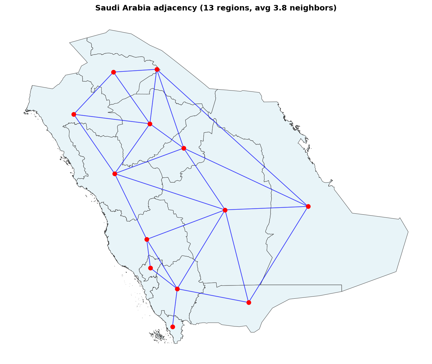
Visualizing the Adjacency Structure
Plot region centroids (red dots) and draw a blue line between every pair of neighbors. The result is the visual counterpart to the lines of the graph file above:
import matplotlib.pyplot as plt

w         = adj['weights']
centroids = saudi.geometry.centroid          # one point per region

fig, ax = plt.subplots(figsize=(10, 8))
saudi.plot(ax=ax, facecolor='#e8f4f8', edgecolor='#333', linewidth=0.5)

# Draw one segment per (i, j) neighbor pair.
for i, neighbours in w.neighbors.items():
    xi, yi = centroids.iloc[i].x, centroids.iloc[i].y
    for j in neighbours:
        xj, yj = centroids.iloc[j].x, centroids.iloc[j].y
        ax.plot([xi, xj], [yi, yj], 'b-', alpha=0.5, linewidth=1)

ax.scatter(centroids.x, centroids.y, c='red', s=40, zorder=5)
ax.set_title(f'Saudi Arabia adjacency ({len(saudi)} regions, '
              f'avg {w.mean_neighbors:.1f} neighbors)', fontweight='bold')
ax.axis('off')
plt.tight_layout(); plt.show()
3. Creating the ID Mapping
Your data likely has region names (e.g., "Riyadh", "Makkah"), but the model needs integer IDs. The mapping connects names to IDs based on the GeoDataFrame row order.
def create_region_mapping(gdf, name_col='NAME_1'):
    """Create bidirectional mapping between region names and IDs.

    Parameters
    ----------
    gdf : geopandas.GeoDataFrame
        Administrative boundaries (row order defines IDs)
    name_col : str
        Column containing region names

    Returns
    -------
    dict with keys:
        'id_to_name': {1: 'Region A', 2: 'Region B', ...}
        'name_to_id': {'Region A': 1, 'Region B': 2, ...}
        'names': ['Region A', 'Region B', ...] in order
    """
    names = gdf[name_col].tolist()

    return {
        'id_to_name': {i + 1: name for i, name in enumerate(names)},
        'name_to_id': {name: i + 1 for i, name in enumerate(names)},
        'names': names
    }

# Create mapping
mapping = create_region_mapping(saudi, 'NAME_1')

# Display the mapping
print("Region ID Mapping:")
print("-" * 40)
for id, name in mapping['id_to_name'].items():
    print(f"  ID {id:2d} -> {name}")
Region ID Mapping:
----------------------------------------
  ID  1 -> 'Asir
  ID  2 -> AlBahah
  ID  3 -> AlHududashShamaliyah
  ID  4 -> AlJawf
  ID  5 -> AlMadinah
  ID  6 -> AlQassim
  ID  7 -> ArRiyad
  ID  8 -> Ash-Sharqīyah
  ID  9 -> Ḥaʼil
  ID 10 -> Jizan
  ID 11 -> Makkah
  ID 12 -> Najran
  ID 13 -> Tabuk
Show Neighbors with Names
# Display neighbor structure with actual names
print("Neighbor Structure:")
print("=" * 60)
for i in range(len(saudi)):
    region_name = mapping['id_to_name'][i + 1]
    neighbor_indices = adj['neighbors'][i]
    neighbor_names = [mapping['id_to_name'][j + 1] for j in neighbor_indices]
    print(f"{region_name}:")
    print(f"    Neighbors: {neighbor_names}")
Neighbor Structure:
============================================================
Al Bahah:
    Neighbors: ['Al Madinah', 'Al Qasim']
Al Hudud ash Shamaliyah:
    Neighbors: ['Al Qasim', 'Ar Riyad', 'Najran']
Ar Riyad:
    Neighbors: ['Al Hudud ash Shamaliyah', 'Al Jawf', 'Al Qasim', 'Ash Sharqiyah', 'Jazan']
...
4. Preparing Your Data
Your dataset needs a column with the spatial ID that matches the graph file. This column will be used in the random effect specification.
import pandas as pd
import numpy as np

# Example: Create data with region names
np.random.seed(42)
n_regions = len(saudi)

# Your raw data might have region names
data = pd.DataFrame({
    'region_name': mapping['names'],
    'cases': np.random.poisson(50, n_regions),
    'population': np.random.randint(100000, 5000000, n_regions)
})

# ADD THE SPATIAL ID COLUMN - this links data to the graph
data['region_id'] = data['region_name'].map(mapping['name_to_id'])

# Add offset for Poisson model (log of expected count)
data['log_pop'] = np.log(data['population'])

print("Data with spatial ID:")
print(data)
Data with spatial ID:
             region_name  cases  population  region_id    log_pop
0                  'Asir     47      628178          1  13.350579
1                AlBahah     55     2763046          2  14.831844
2   AlHududashShamaliyah     42     2686644          3  14.803803
3                 AlJawf     52     2670406          4  14.797741
4              AlMadinah     58     3516664          5  15.073023
5               AlQassim     43     3485659          6  15.064168
6                ArRiyad     46     3485357          7  15.064081
7          Ash-Sharqīyah     49     2895513          8  14.878673
8                  Ḥaʼil     52     1565689          9  14.263837
9                  Jizan     45      168148         10  12.032600
10                Makkah     49     1925665         11  14.470782
11                Najran     43     2845683         12  14.861314
12                 Tabuk     52     3497723         13  15.067623
This column connects each row of your data to the corresponding region in the graph file. The model uses
region_id to look up neighbors and build the spatial correlation structure.
5. Fitting the Model in pyINLA
Now specify the model using the spatial ID column and graph file.
Model Specification
from pyinla import pyinla

# Model specification for BYM2 (or use 'besag')
model = {
    'response': 'cases',                    # Response variable
    'fixed': [],                             # No fixed effects (intercept only)
    'random': [
        {
            'id': 'region_id',             # Column with spatial IDs (1, 2, 3...)
            'model': 'bym2',               # Spatial model type
            'graph': 'saudi.graph'        # Path to graph file
        }
    ]
}

# Fit the model
# Note: E and offset must be passed as numeric arrays, not column names.
result = pyinla(
    model=model,
    family='poisson',
    data=data,
    E=data['population'].to_numpy(),   # expected count per region (numeric array)
    keep=True
)
# Equivalent log-offset form: offset=data['log_pop'].to_numpy()

# View results
print("Fixed Effects:")
print(result.summary_fixed)

print("\nHyperparameters:")
print(result.summary_hyperpar)

print("\nSpatial Random Effects (first 5):")
print(result.summary_random['region_id'].head())
'besag': Pure spatial effect (ICAR model)'bym2': Spatial + unstructured effect (recommended, better for disconnected regions)
Extract Posterior for Plotting
BYM2 stores the combined effect \(b + u\) in the first \(n\) rows of
summary_random['region_id'] and the structured component \(u\) alone
in rows \(n+1 \dots 2n\). Slice [:n] to align with the GeoDataFrame.
For plain Besag, the table is already length \(n\).
# Get posterior summaries; for BYM2 take the first n rows (combined b+u).
n = len(saudi)
posterior = result.summary_random['region_id'].iloc[:n]

# Add to GeoDataFrame for plotting
saudi_plot = saudi.copy()
saudi_plot['posterior_mean'] = posterior['mean'].values
saudi_plot['posterior_sd'] = posterior['sd'].values

# For relative risk interpretation (if using Poisson)
saudi_plot['relative_risk'] = np.exp(posterior['mean'].values)
6. Plotting Results on Maps
Basic Choropleth Map
import matplotlib.pyplot as plt

def plot_choropleth(gdf, values, title, cmap='RdYlBu_r'):
    """Plot values on a choropleth map."""
    fig, ax = plt.subplots(figsize=(10, 8))

    gdf_plot = gdf.copy()
    gdf_plot['value'] = values

    gdf_plot.plot(
        column='value',
        ax=ax,
        legend=True,
        legend_kwds={'shrink': 0.7, 'label': title},
        cmap=cmap,
        edgecolor='black',
        linewidth=0.5
    )

    ax.set_title(title, fontsize=14, fontweight='bold')
    ax.axis('off')
    plt.tight_layout()
    return fig, ax

# Example: Plot simulated posterior means
np.random.seed(123)
posterior_mean = np.random.normal(0, 0.4, len(saudi))

fig, ax = plot_choropleth(saudi, posterior_mean, "Spatial Random Effect")
plt.savefig('spatial_effect.png', dpi=150, bbox_inches='tight')
plt.show()
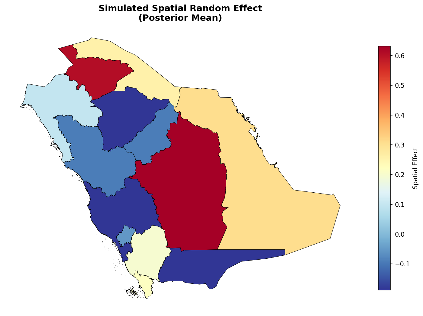
Example output: Simulated spatial random effect values for Saudi Arabia regions
Map with Region Labels
def plot_map_with_labels(gdf, values, name_col='NAME_1', title="Map"):
    """Plot choropleth with region name labels."""
    fig, ax = plt.subplots(figsize=(12, 10))

    gdf_plot = gdf.copy()
    gdf_plot['value'] = values

    gdf_plot.plot(column='value', ax=ax, legend=True, cmap='RdYlBu_r',
                  edgecolor='black', linewidth=0.5)

    # Add labels at region centroids
    for idx, row in gdf_plot.iterrows():
        centroid = row.geometry.centroid
        ax.annotate(
            row[name_col],
            xy=(centroid.x, centroid.y),
            ha='center', va='center',
            fontsize=7, fontweight='bold',
            bbox=dict(boxstyle='round,pad=0.2', facecolor='white', alpha=0.7)
        )

    ax.set_title(title, fontsize=14, fontweight='bold')
    ax.axis('off')
    return fig, ax

# Plot relative risk with labels
np.random.seed(456)
relative_risk = np.exp(np.random.normal(0, 0.3, len(saudi)))

fig, ax = plot_map_with_labels(saudi, relative_risk, 'NAME_1', "Relative Risk by Region")
plt.show()
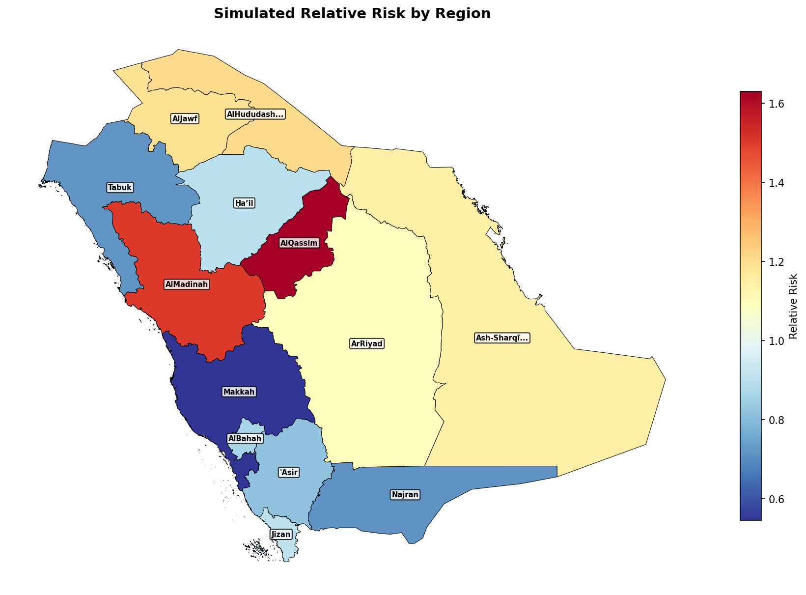
Example output: Simulated relative risk with region name labels
Side-by-Side: Mean and Uncertainty
def plot_mean_and_sd(gdf, mean_values, sd_values, title_prefix=""):
    """Plot posterior mean and SD side by side."""
    fig, axes = plt.subplots(1, 2, figsize=(16, 7))

    gdf_plot = gdf.copy()
    gdf_plot['mean'] = mean_values
    gdf_plot['sd'] = sd_values

    # Left: Posterior mean
    gdf_plot.plot(column='mean', ax=axes[0], legend=True, cmap='RdYlBu_r',
                  edgecolor='black', linewidth=0.3)
    axes[0].set_title(f'{title_prefix}Posterior Mean', fontweight='bold')
    axes[0].axis('off')

    # Right: Posterior SD
    gdf_plot.plot(column='sd', ax=axes[1], legend=True, cmap='YlOrRd',
                  edgecolor='black', linewidth=0.3)
    axes[1].set_title(f'{title_prefix}Posterior SD (Uncertainty)', fontweight='bold')
    axes[1].axis('off')

    plt.tight_layout()
    return fig, axes

# Example
np.random.seed(789)
mean_values = np.random.normal(0, 0.5, len(saudi))
sd_values = np.abs(np.random.normal(0.15, 0.03, len(saudi)))

fig, axes = plot_mean_and_sd(saudi, mean_values, sd_values, "Spatial Effect: ")
plt.show()
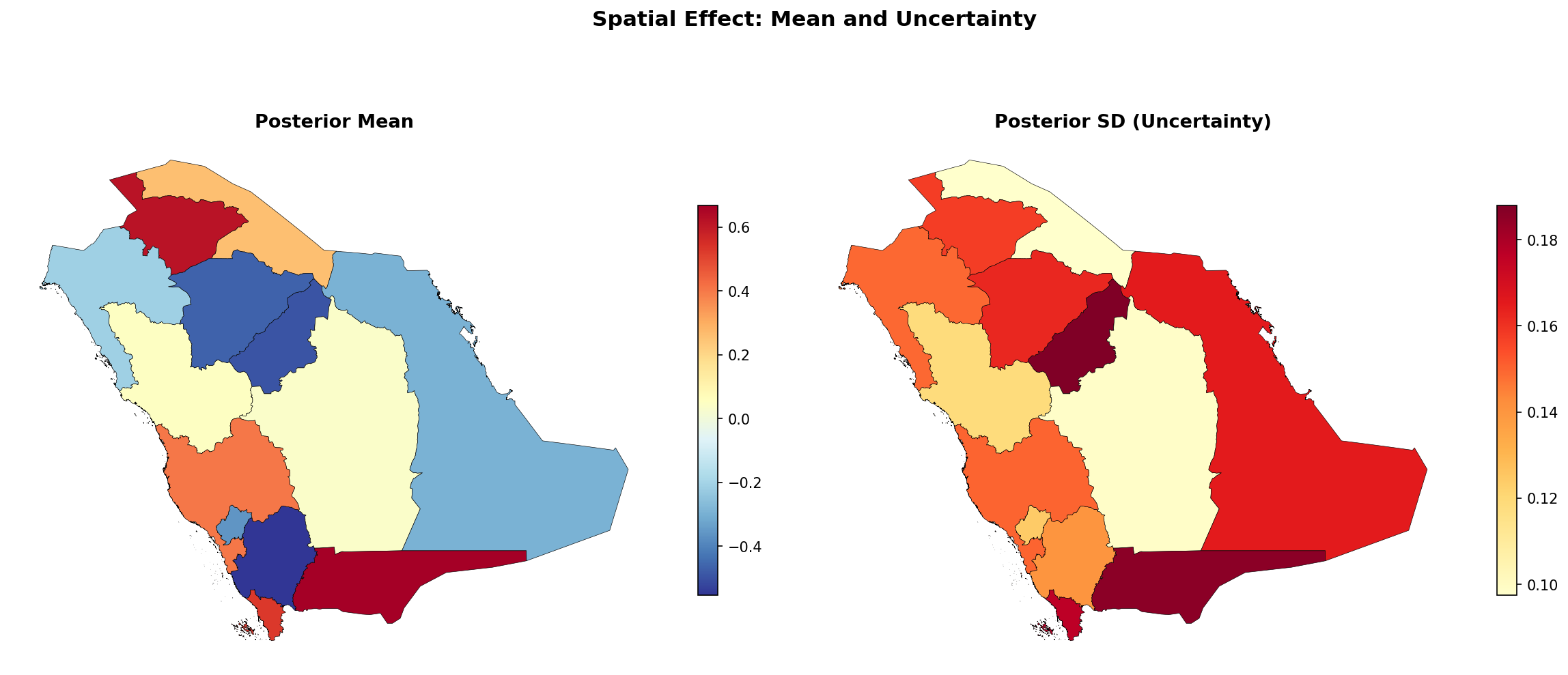
Example output: Posterior mean (left) and uncertainty (right) displayed side by side
Visualize Adjacency Graph
def plot_adjacency(gdf, w, title="Adjacency Structure"):
    """Plot map with neighbor connections."""
    fig, ax = plt.subplots(figsize=(10, 8))

    # Plot regions
    gdf.plot(ax=ax, facecolor='#e8f4f8', edgecolor='#333', linewidth=0.5)

    # Get centroids
    centroids = gdf.geometry.centroid

    # Draw edges between neighbors
    for i, neighbors in w.neighbors.items():
        xi, yi = centroids.iloc[i].x, centroids.iloc[i].y
        for j in neighbors:
            xj, yj = centroids.iloc[j].x, centroids.iloc[j].y
            ax.plot([xi, xj], [yi, yj], 'b-', alpha=0.5, linewidth=1)

    # Draw centroids
    ax.scatter(centroids.x, centroids.y, c='red', s=30, zorder=5)

    ax.set_title(f"{title}\n({len(gdf)} regions, avg {w.mean_neighbors:.1f} neighbors)",
                 fontweight='bold')
    ax.axis('off')
    return fig, ax

# Visualize the neighbor structure
fig, ax = plot_adjacency(saudi, adj['weights'], "Saudi Arabia Regions")
plt.show()
Example: Lebanon with Different Admin Levels
Countries have multiple administrative levels. Level 1 is typically states/provinces/governorates, while Level 2 provides finer divisions (districts/counties). Choose the level that matches your data's spatial resolution.
Comparing Administrative Levels
Lebanon has 8 governorates (Level 1) and 30 districts (Level 2). Load both and draw them side-by-side; load_level is just the helper from Section 1:
import matplotlib.pyplot as plt

lebanon_gov  = get_admin_boundaries('LBN', 1)   # 8 governorates
lebanon_dist = get_admin_boundaries('LBN', 2)   # 30 districts

fig, (ax1, ax2) = plt.subplots(1, 2, figsize=(14, 7))
lebanon_gov.plot(ax=ax1, edgecolor='black', linewidth=0.7, facecolor='#e8f4f8')
ax1.set_title(f'Level 1: Governorates (n={len(lebanon_gov)})', fontweight='bold')
ax1.axis('off')

lebanon_dist.plot(ax=ax2, edgecolor='black', linewidth=0.5, facecolor='#fff7ed')
ax2.set_title(f'Level 2: Districts (n={len(lebanon_dist)})', fontweight='bold')
ax2.axis('off')

plt.tight_layout()
plt.show()
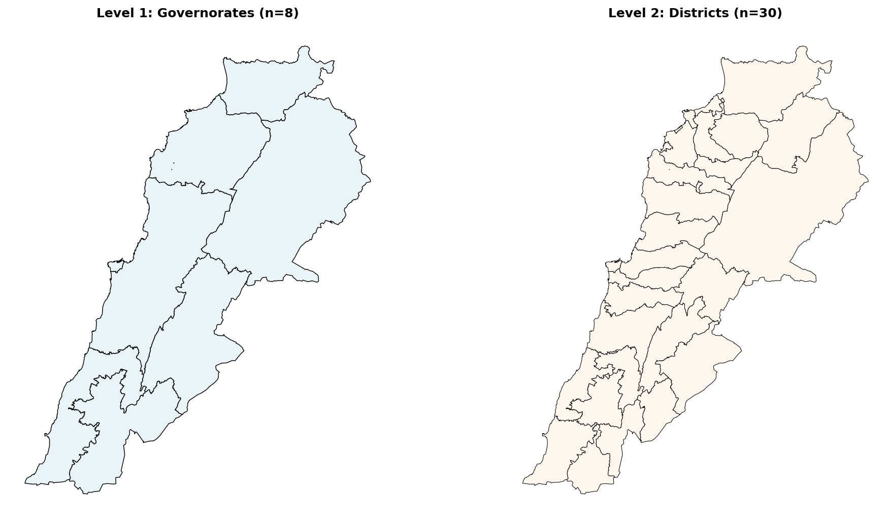
Level 1 (8 governorates) vs Level 2 (30 districts)
Loading Different Levels
# Level 1: Governorates (Muhafazat)
lebanon_gov = gpd.read_file(
    "https://geodata.ucdavis.edu/gadm/gadm4.1/json/gadm41_LBN_1.json"
)
print(f"Level 1: {len(lebanon_gov)} governorates")

# Level 2: Districts (Caza)
lebanon_dist = gpd.read_file(
    "https://geodata.ucdavis.edu/gadm/gadm4.1/json/gadm41_LBN_2.json"
)
print(f"Level 2: {len(lebanon_dist)} districts")
Level 1: 8 governorates
Level 2: 30 districts
Level 1: Governorates with Names
Same pattern as the Saudi preview: gdf.plot(...) plus a centroid annotation per row.
fig, ax = plt.subplots(figsize=(8, 9))
lebanon_gov.plot(ax=ax, edgecolor='black', linewidth=0.7, facecolor='#e8f4f8')

for _, row in lebanon_gov.iterrows():
    c = row.geometry.centroid
    ax.annotate(row['NAME_1'], (c.x, c.y),
                ha='center', va='center', fontsize=8, fontweight='bold',
                bbox=dict(boxstyle='round,pad=0.25', facecolor='white', alpha=0.85))

ax.set_title(f'Lebanon: {len(lebanon_gov)} governorates (ADM1)', fontweight='bold')
ax.axis('off')
plt.tight_layout(); plt.show()
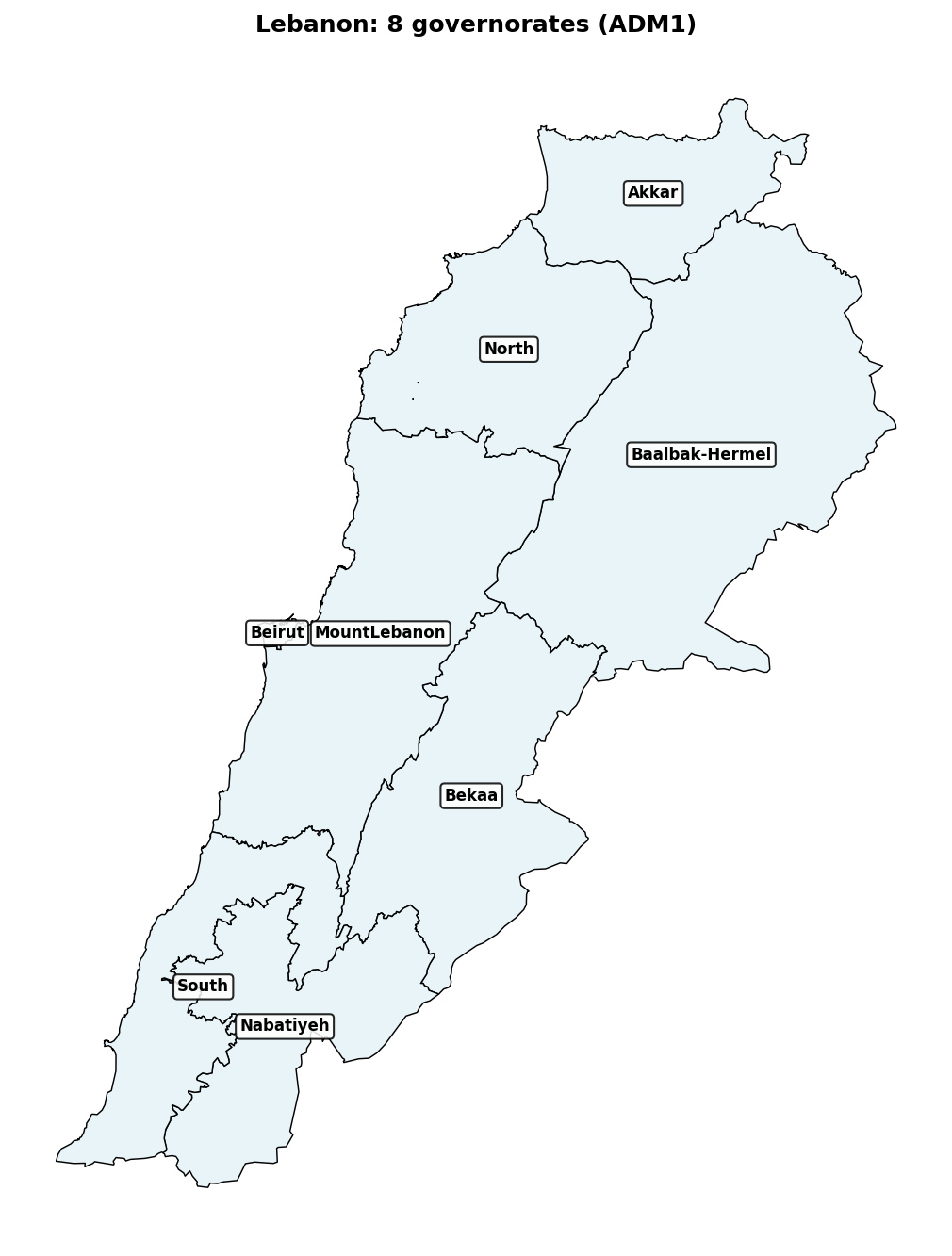
Level 2: Districts with Adjacency
At finer levels the adjacency structure becomes much denser. Build a Queen-contiguity graph on the ADM2 frame and overlay centroid-to-centroid edges:
from libpysal.weights import Queen

w         = Queen.from_dataframe(lebanon_dist)
centroids = lebanon_dist.geometry.centroid

fig, ax = plt.subplots(figsize=(11, 9))
lebanon_dist.plot(ax=ax, facecolor='#fff7ed', edgecolor='#333', linewidth=0.4)

for i, nbrs in w.neighbors.items():
    xi, yi = centroids.iloc[i].x, centroids.iloc[i].y
    for j in nbrs:
        xj, yj = centroids.iloc[j].x, centroids.iloc[j].y
        ax.plot([xi, xj], [yi, yj], 'b-', alpha=0.45, linewidth=0.8)

ax.scatter(centroids.x, centroids.y, c='red', s=20, zorder=5)
ax.set_title(f'Lebanon ADM2: {len(lebanon_dist)} districts '
              f'(avg {w.mean_neighbors:.1f} neighbors)', fontweight='bold')
ax.axis('off')
plt.tight_layout(); plt.show()
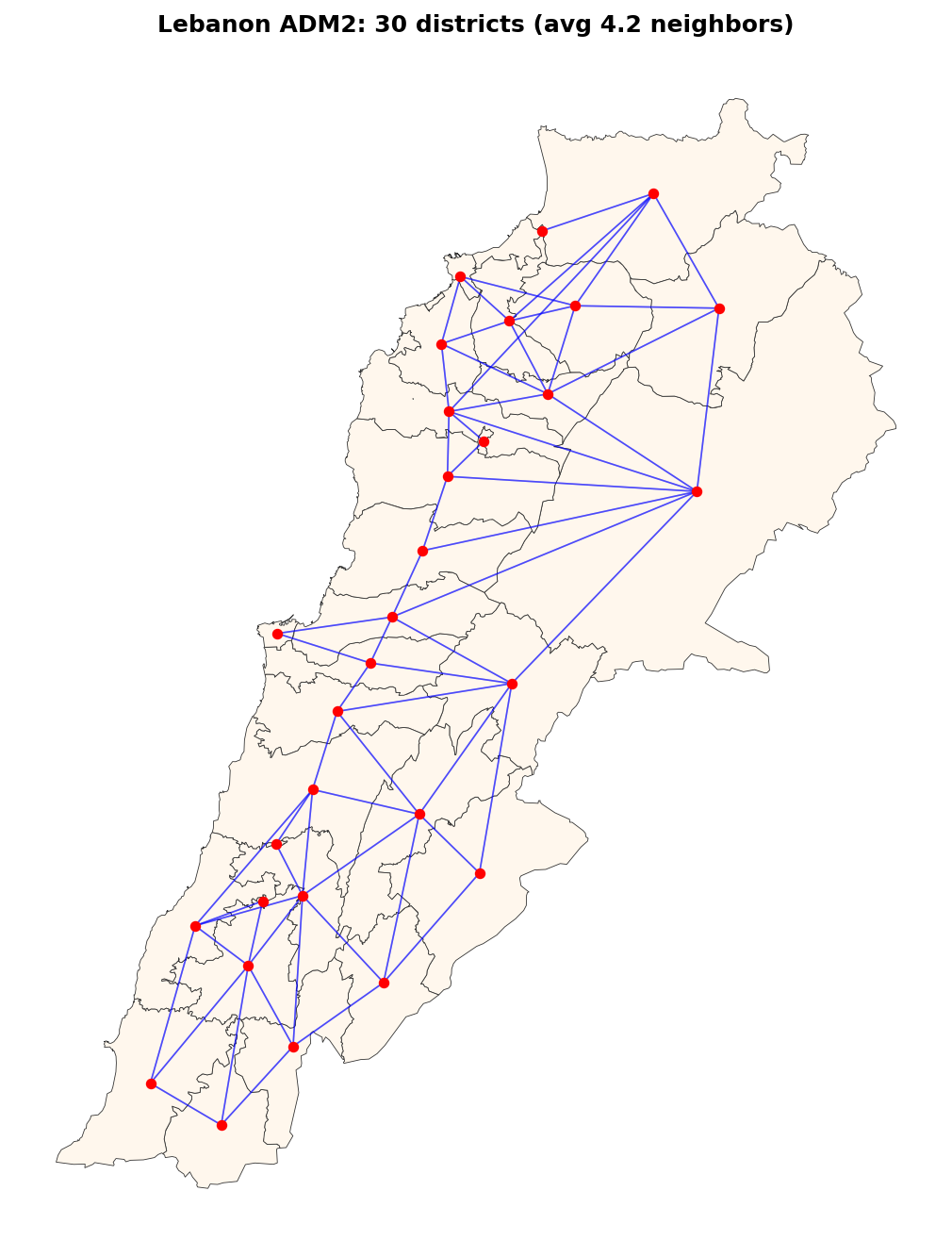
30 districts with average 4.2 neighbors per region
Choropleth at District Level
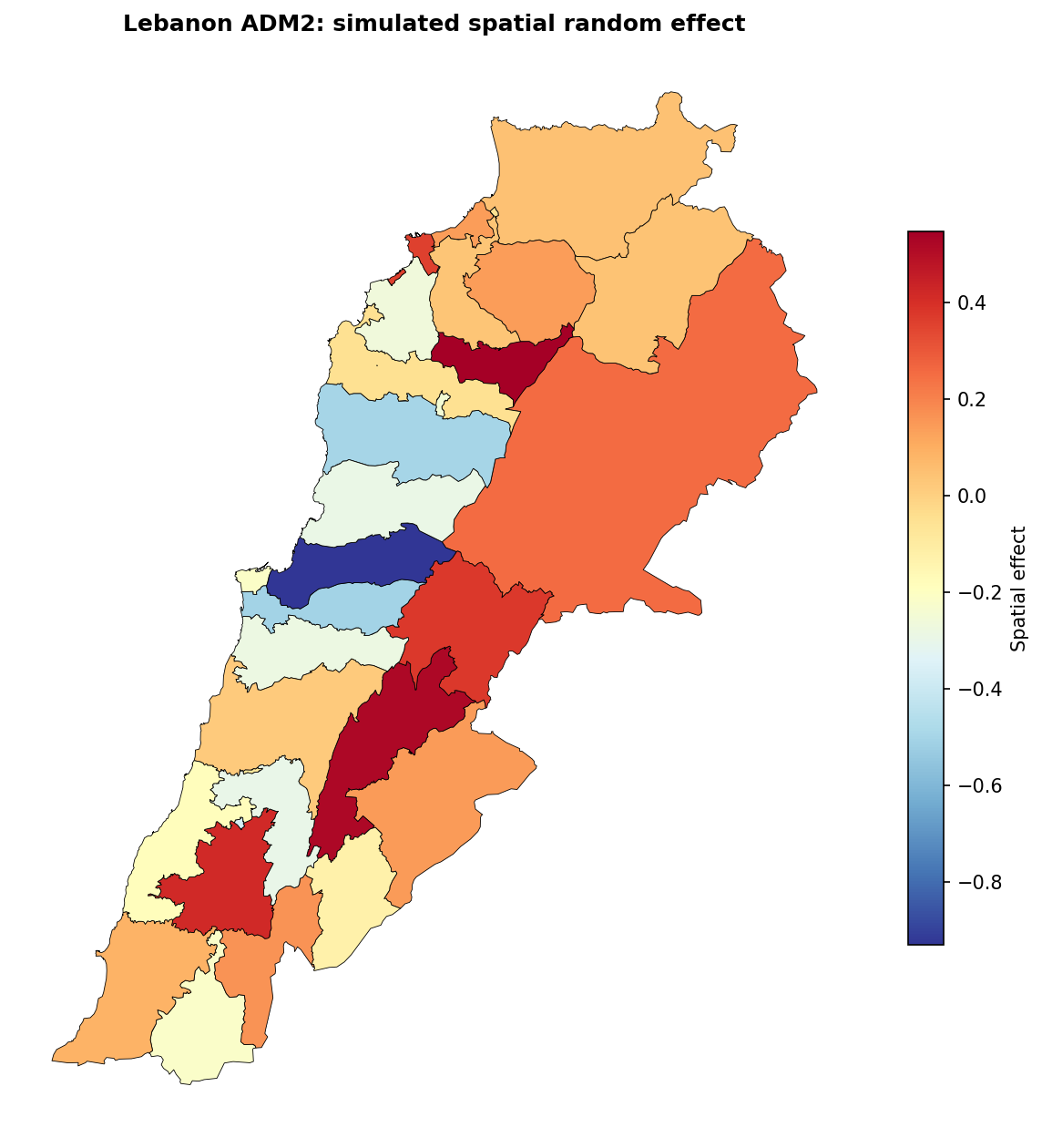
Once you have posterior means from result.summary_random['region_id'], colouring the map is a single gdf.plot(column=...) call. Here we use a simulated effect to keep the snippet self-contained:
import numpy as np

rng = np.random.default_rng(0)
sim = rng.normal(0, 0.4, len(lebanon_dist))   # replace with result.summary_random[...]

fig, ax = plt.subplots(figsize=(8, 9))
lebanon_dist.assign(effect=sim).plot(
    column='effect', ax=ax, legend=True, cmap='RdYlBu_r',
    edgecolor='black', linewidth=0.4,
    legend_kwds={'shrink': 0.6, 'label': 'Spatial effect'},
)
ax.set_title('Lebanon ADM2: simulated spatial random effect', fontweight='bold')
ax.axis('off')
plt.tight_layout(); plt.show()
- Level 1: When your data is aggregated to states/provinces/governorates
- Level 2: When you have finer-resolution data (counties, districts)
- Higher levels: For very detailed spatial analysis (municipalities, etc.)
Quick Reference
Required Packages
pip install geopandas libpysal matplotlib pandas numpy
Complete Minimal Example
import geopandas as gpd
import pandas as pd
import numpy as np
from libpysal.weights import Queen
from pyinla import pyinla

# 1. Download boundaries
gdf = gpd.read_file("https://geodata.ucdavis.edu/gadm/gadm4.1/json/gadm41_SAU_1.json")

# 2. Build and save graph
w = Queen.from_dataframe(gdf)
n = len(gdf)
lines = [str(n)]
for i in range(n):
    neighbors = sorted([j + 1 for j in w.neighbors[i]])
    lines.append(f"{i + 1} {len(neighbors)} {' '.join(map(str, neighbors))}")
with open('graph.graph', 'w') as f:
    f.write('\n'.join(lines))

# 3. Prepare data with spatial ID
data = pd.DataFrame({
    'y': np.random.poisson(50, n),
    'region_id': range(1, n + 1)
})

# 4. Fit model
model = {
    'response': 'y',
    'fixed': [],
    'random': [{'id': 'region_id', 'model': 'bym2', 'graph': 'graph.graph'}]
}
result = pyinla(model=model, family='poisson', data=data)

# 5. Plot results (BYM2 returns 2n rows; first n hold the combined effect b+u)
gdf['effect'] = result.summary_random['region_id']['mean'].values[:n]
gdf.plot(column='effect', legend=True, cmap='RdYlBu_r')